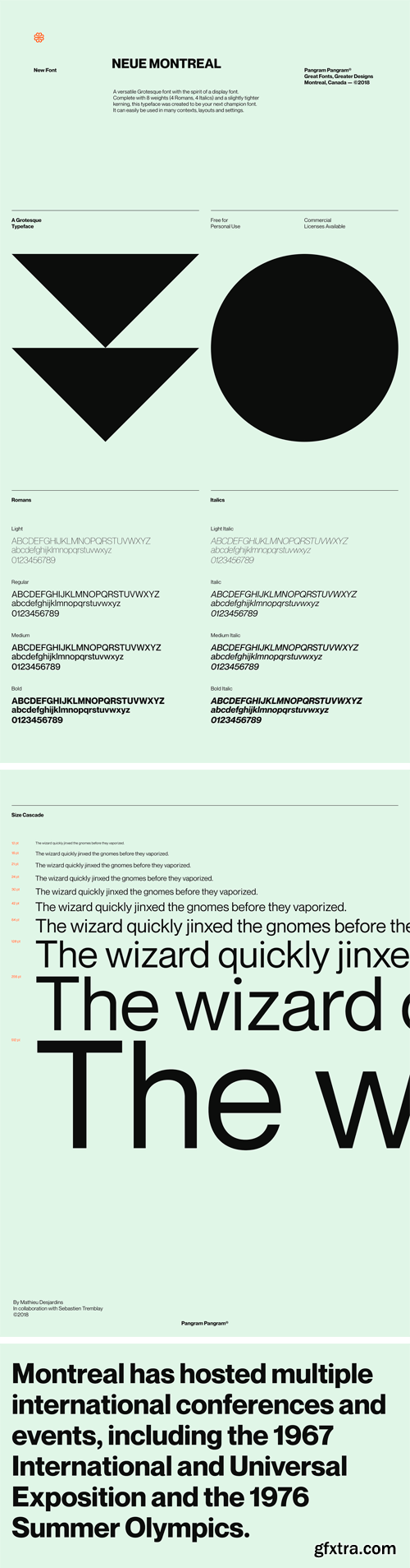
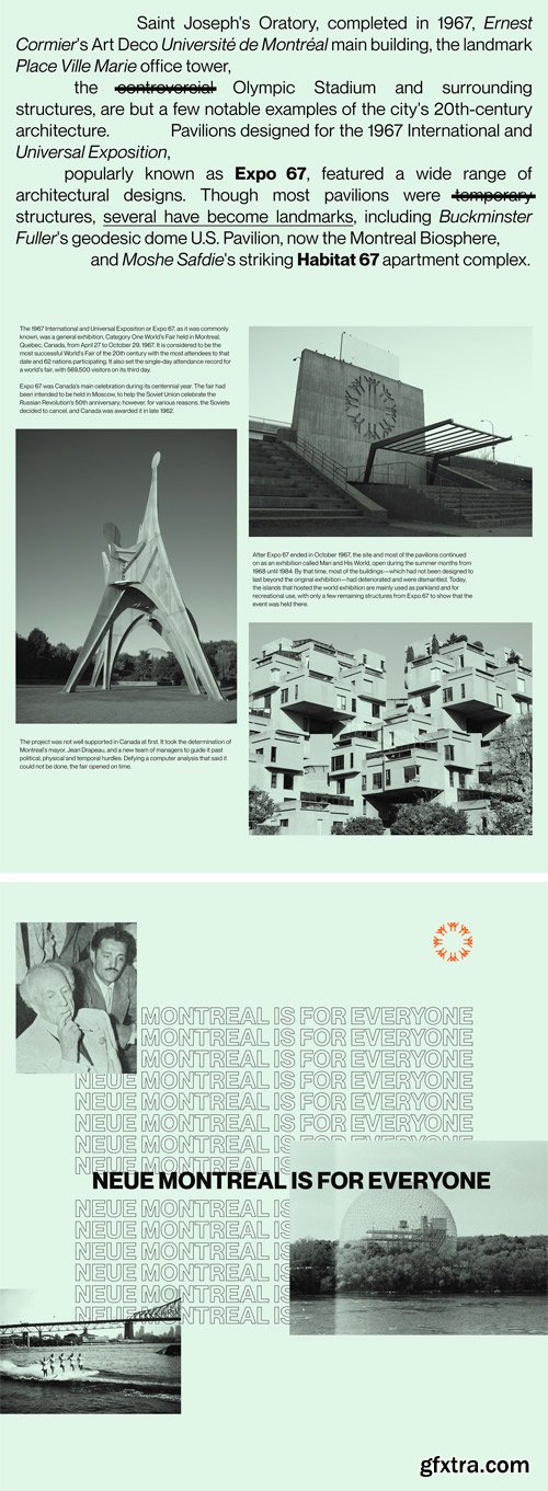
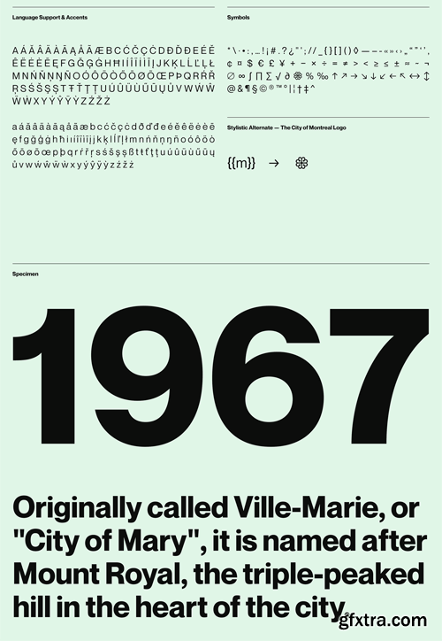
Neue Montreal Font Family
A versatile Grotesque font with the spirit of a display font. Complete with 8 weights (4 Romans, 4 Italics) and a slightly tighter kerning, this typeface was created to be your next champion font. It can easily be used in many contexts, layouts and settings.

Neue Waver Font
Neue Waver is a luxurious serif font that exudes elegance and sophistication with its clean and refined letterforms. Its timeless style creates a sense of luxury and glamour, perfect for high-end branding, editorial design, and other elegant applications. The font’s attention to detail and exquisite craftsmanship make it a stylish choice for any project.


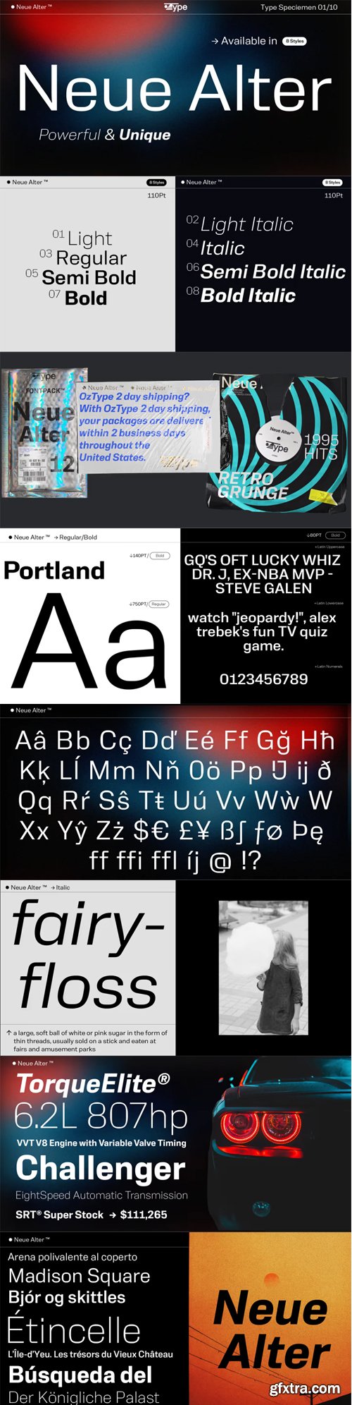
Neue Punk Font
Neue Punk is a cool and unique display font with a brush effect. It has an urban style that will add a grunge and edgy look to your designs.

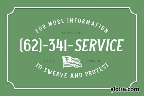
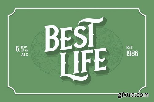
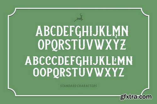
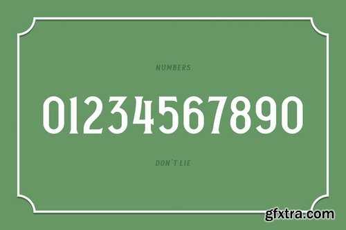
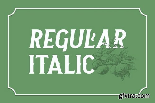
Hello, we’re back with another old but new font; Neue Stanley, all-caps vintage serif with strong, clean, and sharp figures. Inspired by the classic letters that were used in the old advertisements (posters, labels, etc) Mouse-crafted with high attention to the details, satisfaction guaranteed! Whether you’re working on modern or classic themed designs, this font is a must have on your designing arsenal.
OTF | TTF

Originally designed in 1928, Plak is something of a lost gem in the type world. Despite being drawn by Futura creator Paul Renner, it never achieved the same popularity and spent decades lacking a much-needed digital revival. Monotype designers Linda Hintz and Toshi Omagari have taken its existing three weights and, after extensive research into the original wood type, extended them into the vast Neue Plak family. The typeface is available in 60 weights that stay true to Renner’s intentions, and offer the same blend of “quirky” details and “German stiffness” – as Hintz describes it. The design is an unusual mixture, bringing together a defiant outer appearance that’s counteracted by more playful details found in the lowercase r, and the large dots of the lowercase i. Other distinctive details include open or strikethrough counters, and a set of hairline widths that reduce Renner’s original design to its bare bones. Neue Plak’s display weights are crying out to be used in editorial, on packaging or in logos, while its text weight works well in both print and digital environments.

https://www.myfonts.com/collections/neue-einstellung-font-hanken-design-co
Neue Einstellung is a geometric typeface with simplicity and straightforwardness that stands out in small or large scale applications. Inspired by the Einstellung Effect, it embodies rigidity in the way it looks and the way it performs. It has been used by contemporary brands all over the world due to the clean and minimalistic feel that it promotes.


https://www.myfonts.com/collections/neue-latein-font-lena-schmidt
This sans serif font carries the flair and mood our Schneidler Latein font family. The calligraphic appearance and the human sound are evident thanks to the preservation of some significant broad edged pen elements. The forms are reduced to the subtle level where they are simplified, but the essence still remains. The expressive and artistic expression of the Schneidler Latein continues to work like a background melody. Together they build a superfamily that works perfectly in combination with each other. More weights will follow soon.


https://www.myfonts.com/collections/neue-june-font-matt-chansky
Four years of development imbue Neue June with its uniquely crafted high x-height, enabling designers to literally and figuratively elevate layout designs. In today’s highly competitive brand marketplace, readability across communication platforms and memorability go hand in hand towards target audience retention. Neue June comes in six weights, from elegant thin to full-bodied emphatic bold, plus italics. You’ll find a robust selection of highly refined multilingual glyphs. In addition to a suite of ligatures, there are a number of extra characters, such as the estimated symbol, the number sign, and directional arrows. When the creative direction calls for sophisticated and memorable tactics—leverage the versatile 385 glyph count for big messages and easily consumable body copy.
SermonBox - Seasonal Collection

SermonBox - The Series Pack Collection

Top Rated News


Would you like to be a Author?


